Swell Credit
Mobile Design + Digital Marketing + Direct Mail + ResearchSwell Financial, Inc. // 2023
Swell Financial, Inc. // 2023

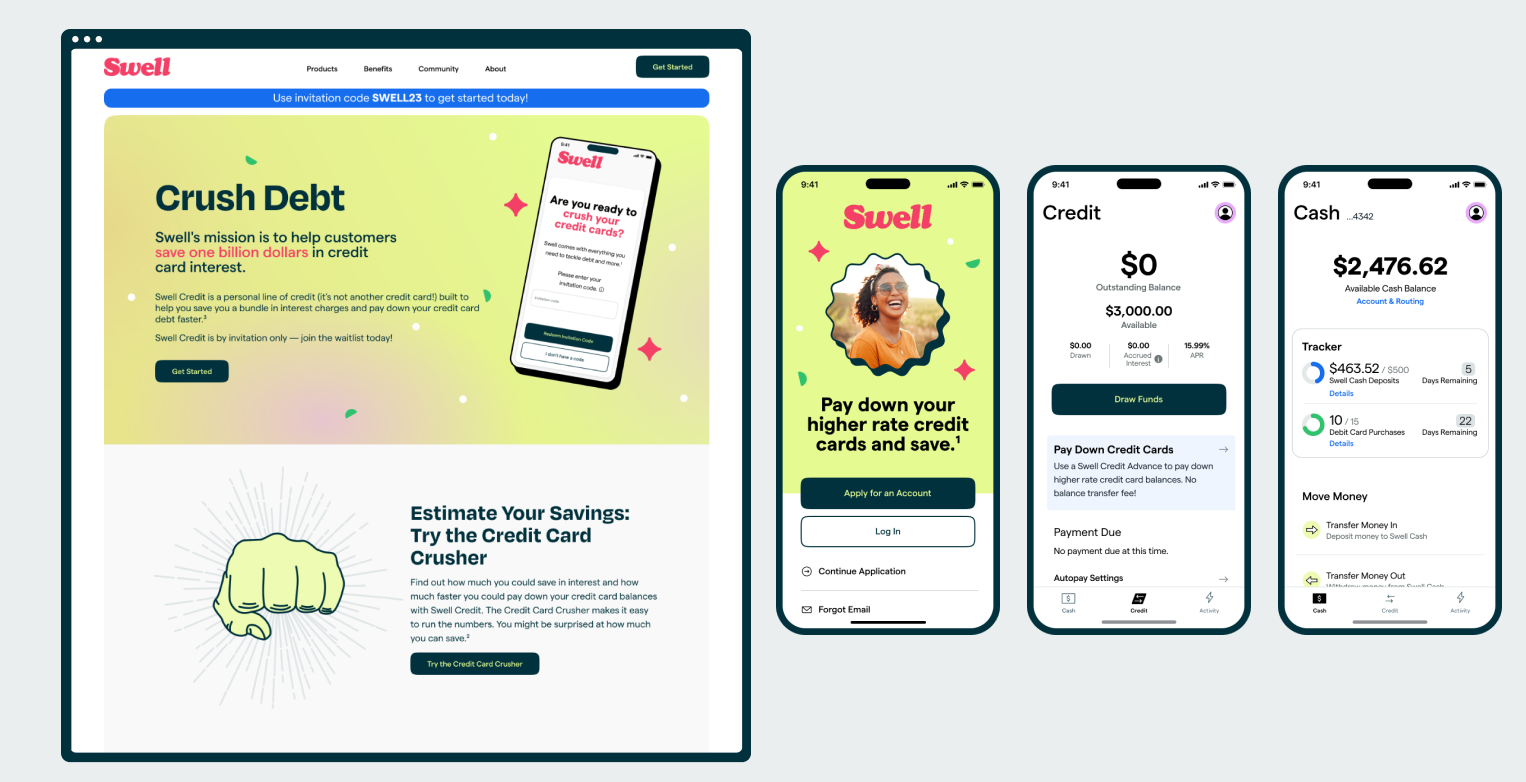
Swell is a money app born from the vision of bringing better banking to all Americans. The leadership team had deep experience in the personal lending market and knew that Americans’ appetite for credit was increasing with time. A personal line of credit is a less utilized product in the industry, but would help set Swell apart from competitors.
Americans are very familiar with credit cards and how they work. Unfortunately, they often have very high interest rates and people who have built up credit card debt often struggle to pay down their balances and get out of debt.
The Swell product team was quite small and consisted of myself as the sole designer, 4 developers, and 3 product managers. We did collaborate heavily with two partner companies (a bank and a lender) and had many legal representatives that also collaborated and needed to sign off on all final concepts.
The product team dove head first into conceptualizing, prototyping and testing a line of credit that would function as a credit card alternative. In early testing, we discovered that one of the biggest challenges to this concept was that, because credit cards have been so heavily marketed for so long, most people’s first impressions of Swell Credit was that it was, in fact, a credit card. We needed to be sure that Swell Credit was positioned in a way that made it very clear that it was NOT a credit card. We also needed to provide clear language about what the product was and how to use it.
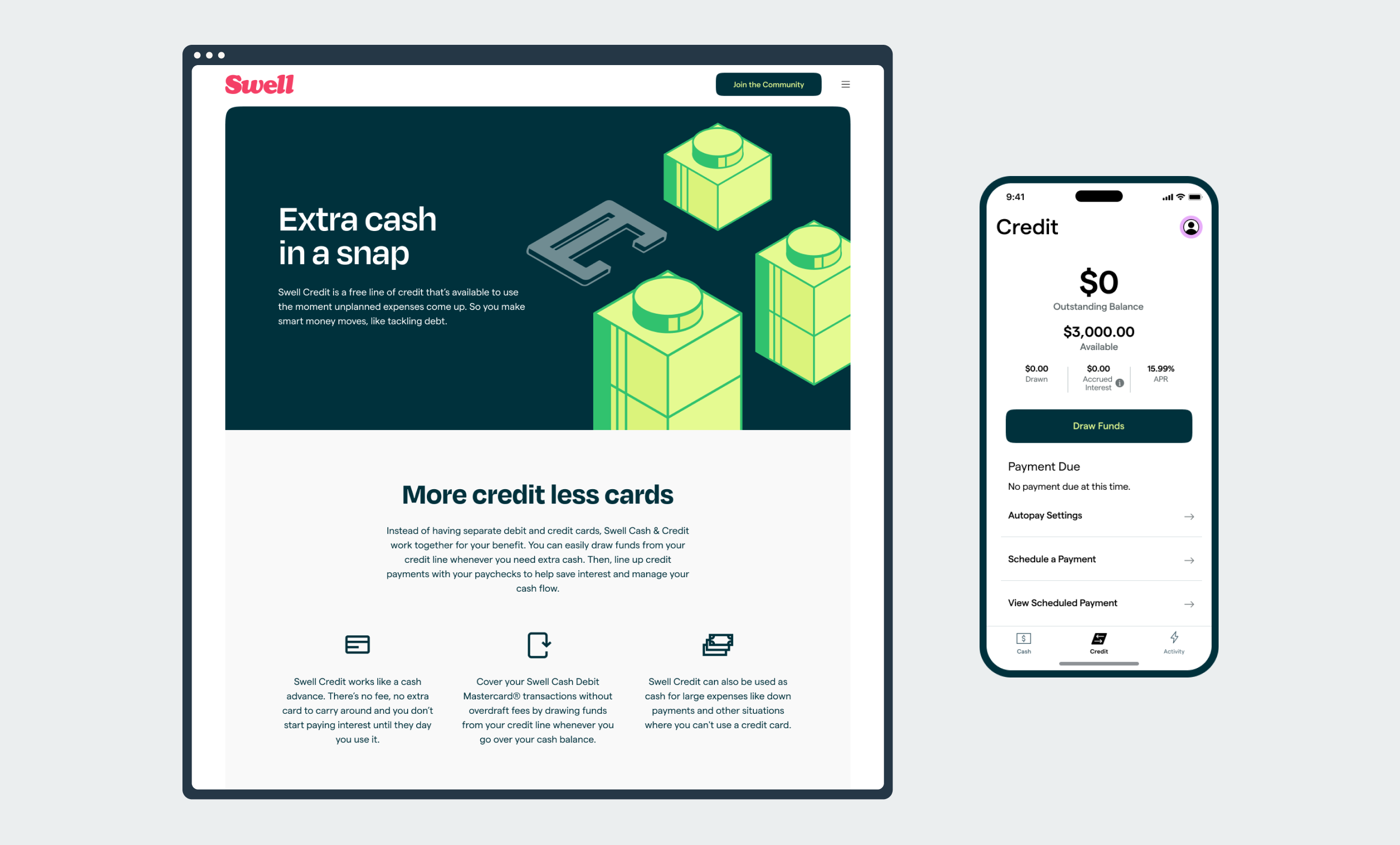
A direct mail marketing initiative was launched, but the response rate turned out to be much lower than expected. The analysis of the lackluster response was that positioning Swell Credit as a credit card alternative wasn’t alluring enough to potential customers.
To give the line of credit a more concrete use case, the team decided to pivot the product to be a solution focused on offering reduced interest rates for people who had existing credit card debt. From a technical perspective, it was relatively simple pivot. Users would be able to input their existing credit card debts. Swell would then cut a check to their specified credit card, and users would start paying down their balances at a lower interest rate in the Swell app.
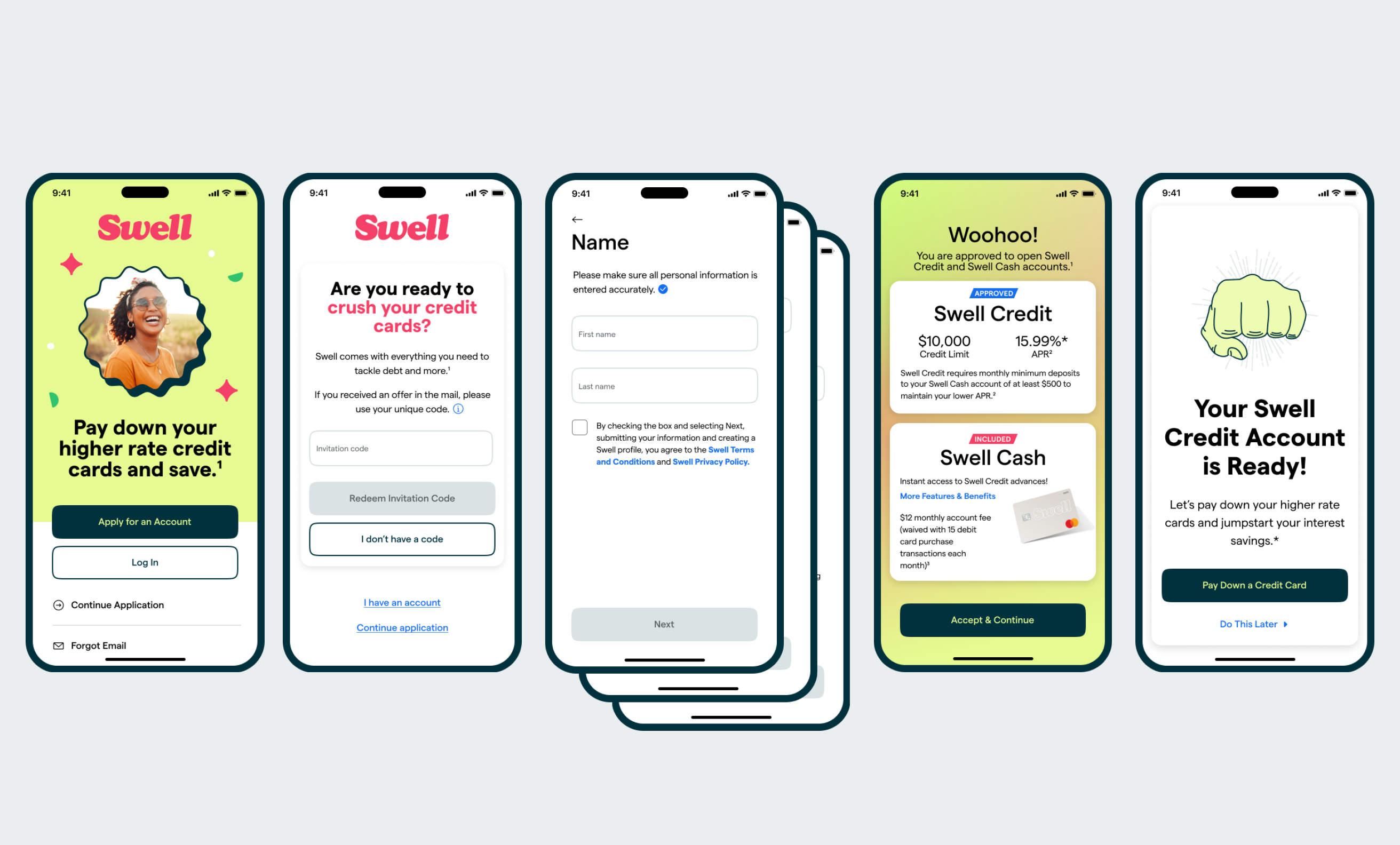
The bigger challenge with this pivot was in retelling the story from a marketing perspective and narrowing the user experience of the app to be for people specifically looking to use the line of credit. Previously, the line of credit was an optional product add on, and the digital checking account was being marketed to a much broader audience.
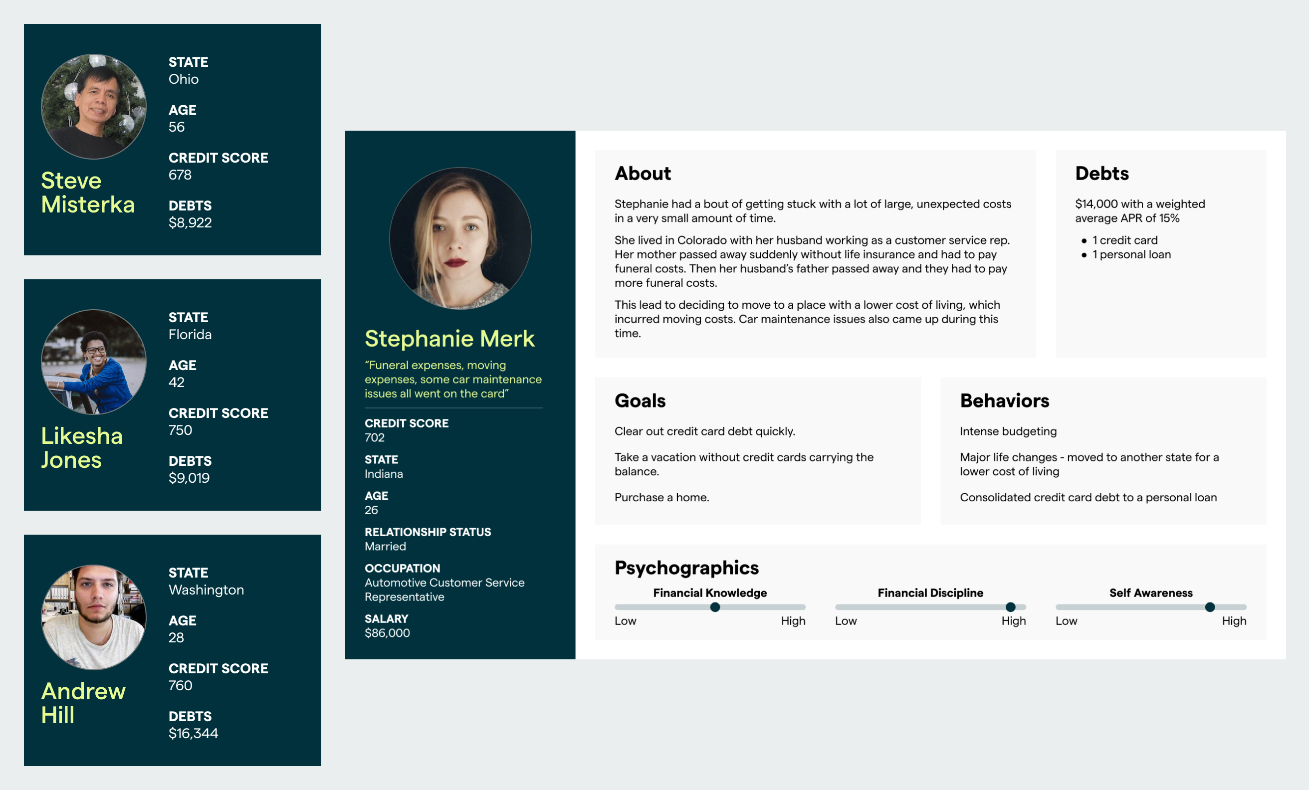
The business stakeholders wished to target users that were on the higher end of the spectrum in terms of credit scores. The product team set out to build a library of personas and stories on why people in the desired credit score range had built up credit card debt so that we could communicate an offer that would really appeal to them.
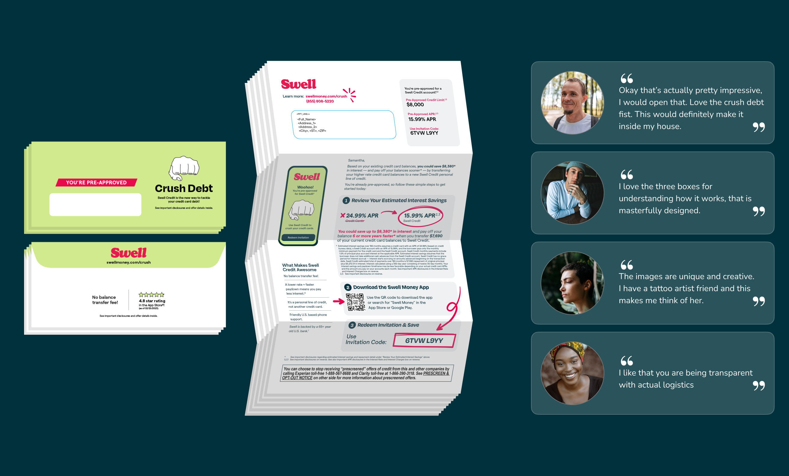
Because the only way to legally market targeted advertising to people based on credit bureau date is through direct mail, the team set out to create the next mail piece that explained our new offer. Due to the complexity of the offer and the challenge of making it as digestible as possible, we conducted 18 qualitative interviews (along with several quantitative studies) that looked at both the direct mail piece and marketing website designs. Each interview yielded countless improvements to the content. The new mail piece went through over 70 iterations before I and the rest of my team felt confident enough to ship it.
Digital marketing also went through several rounds of iteration and development. Emphasis was placed on savings throughout, both with money and time. Users were able to drive to a custom built calculator that enabled them to put in their specific credit card balance information and see what APR they’d be eligible for with Swell Credit. The page would show them a direct comparison of savings on their current cards and balances against what would be possible with Swell Credit.
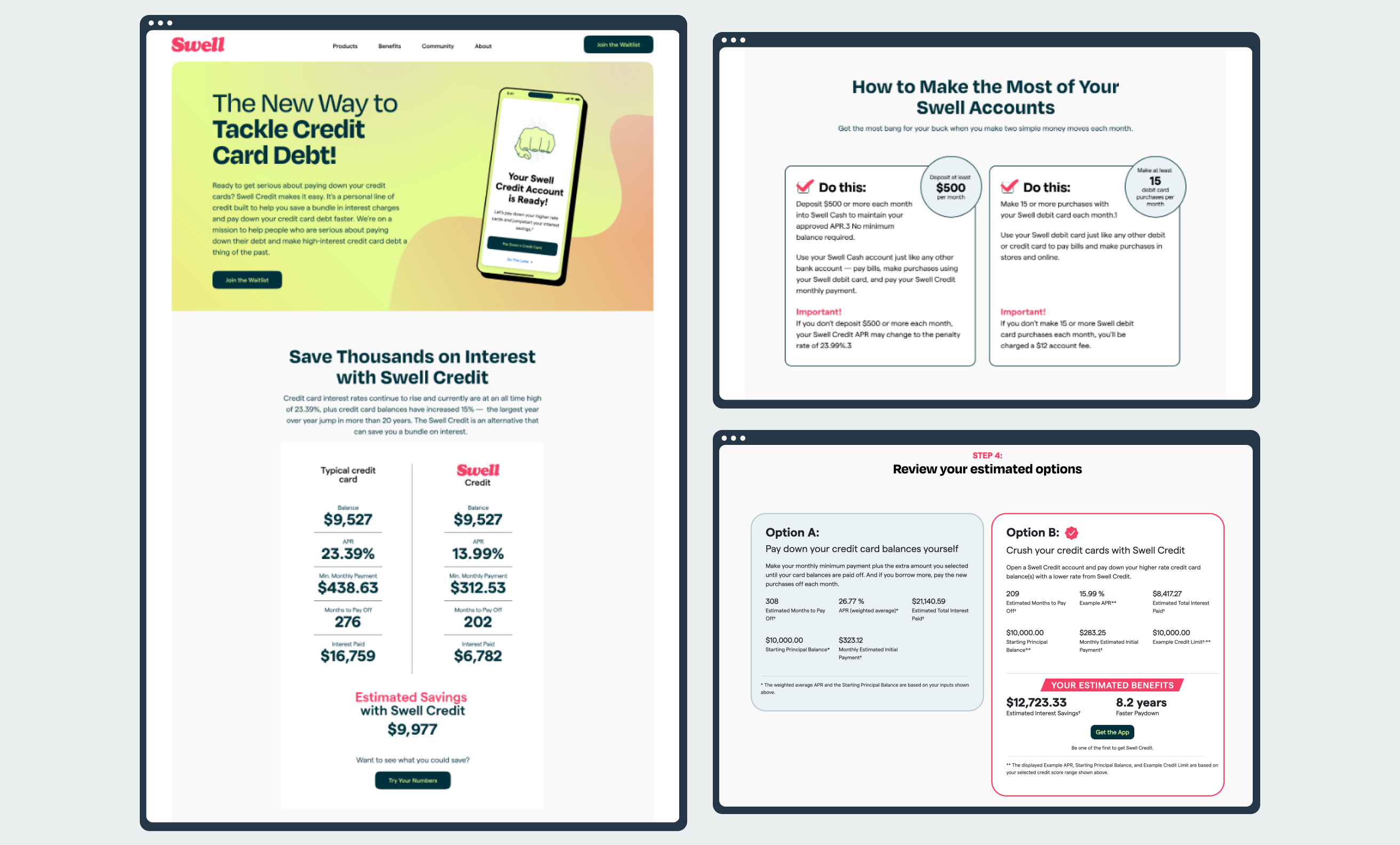
While it’s not a new paradigm for financial products to have a variety of rules or guidelines in place, it’s not common for them to have an interface in place that allows a user to easily track their progress. While working on financial products, I’ve had many moments of drawing parallels between the health tracking space and financial tracking. Because Swell was asking people to perform specific behaviors, we wanted to make it really accessible for them to learn these behaviors and track how they were doing on a monthly basis. The Swell tracker went through may iterations. The original concept had been intended for people to earn a higher APY on their digital checking account, but due to pivots along the way, the latest design was repurposed for people to track the criteria on keeping their low interest rate and to help them waive the monthly fee.
Largely because of movement in the financial market as of winter/spring 2023, investors were feeling uneasy about contributing more cash to a risky startup. It was decided that Swell should be consolidated with one of the partner companies. While I and my team members weren’t able to continue to see the product through to growth, we had certainly learned many lessons along the way and had created a product we were very proud of.