Swell: Building a Brand
Brand Design + Design SystemSwell Financial, Inc. // 2022
Swell Financial, Inc. // 2022
I was brought onto the Central Pacific Bank (CPB) team by Kevin Dahlstrom (@camp4), CPB’s CMO at the time, and he had a vision to bring better banking to all Americans. Swell began as an island inspired sub-brand of CPB that would focus on the mainland market, but would deliver CPB’s good banking ethos and trademark customer service. Early data showed that mainland banking customers did not feel well serviced by the big four (JP Morgan Chase, Bank of America, Wells Fargo, Citi), and small banks and credit unions often struggle to bring quality technology to their customers.
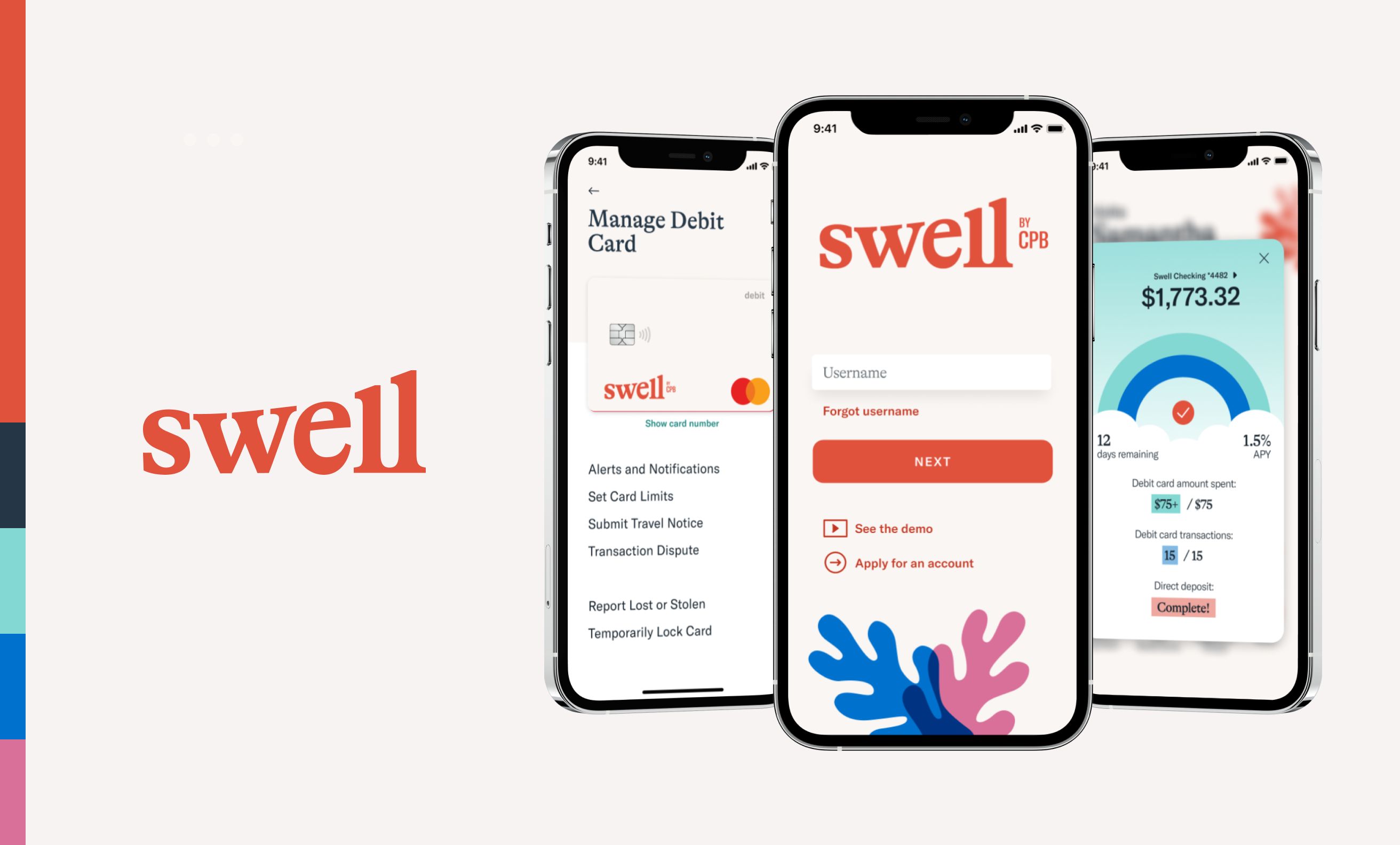
Swell was kicked off with a branding exercise conducted by the bank’s agency partner at the time. The original brand was rooted in Hawaiian-inspired elements and a color palette that coordinated with the parent CPB brand. Mobile app concepts came shortly after preliminary brand elements were decided on. The team really wanted good juju to be part of this brand and product experience, and many value propositions were designed and tested as part of the business exploration. Early concepts included features that gave back to the earth and community at large. The business hypothesis at this time was that banking customers wanted to feel their bank left a good imprint in their community and cared about the environment.
The business stakeholders invested heavily in testing a wide variety of concepts. Within a few months, it became clear that leaning on island culture as a core part of the brand wouldn’t resonate with the mainland consumer. Regulatory limitations also became immensely more clear in that CPB would not be able to operate in the mainland without distracting from their already successful business in Hawaii. Two major decisions were made based on this information:
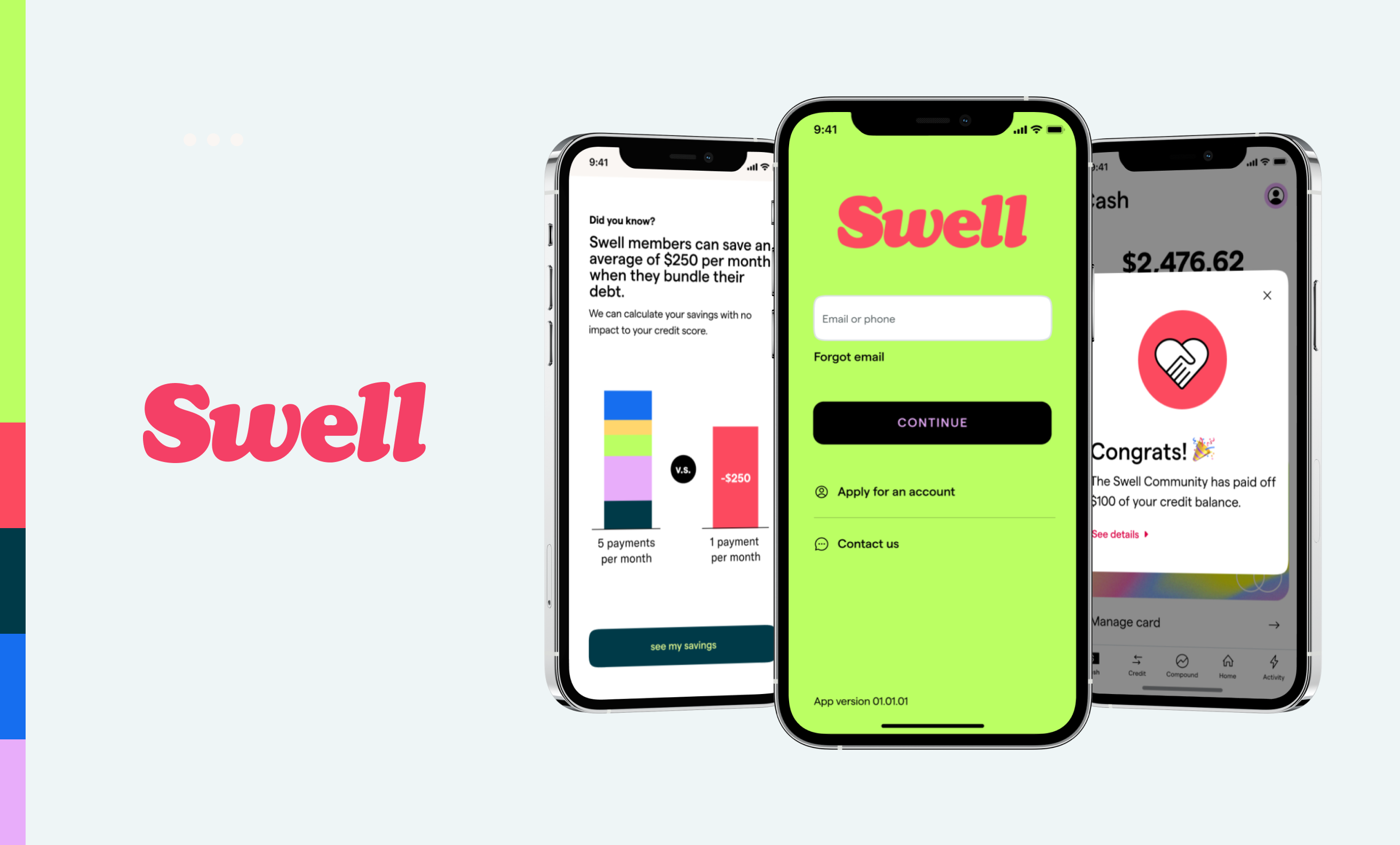
While I didn’t have much of a role in the business spinoff, I did contribute to the next iteration of the brand quite a lot. Kevin really wanted a brand that would stand out from the banking crowd and gave our agency partner some very loose guidance to create something that would stand out. They sent back to us many concepts, and a base direction was chosen.
By this time, it was decided to part ways with the agency and design became wholly my responsibility. On taking the base brand direction that included a logo, color palette and marketing website template into a definitive digital direction, several problems were spotted.
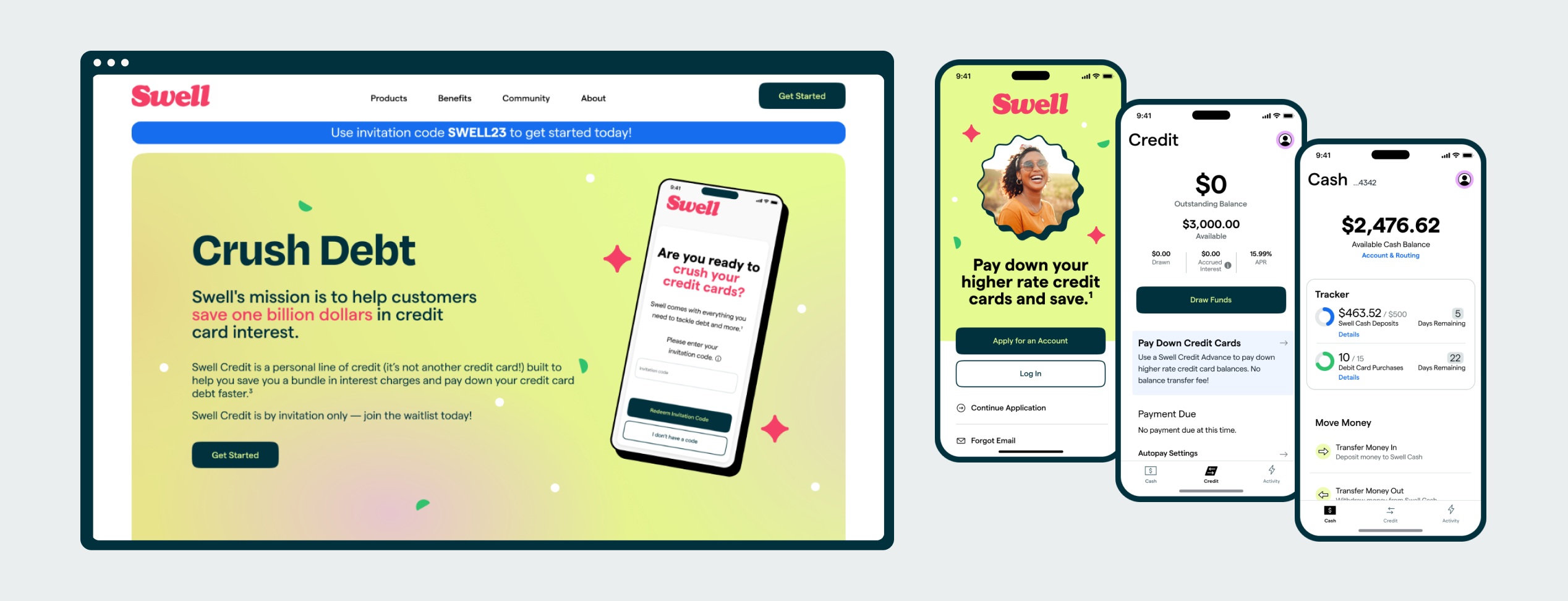
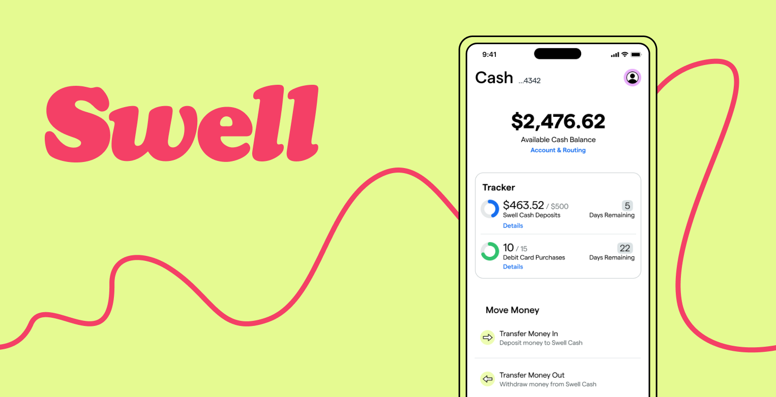
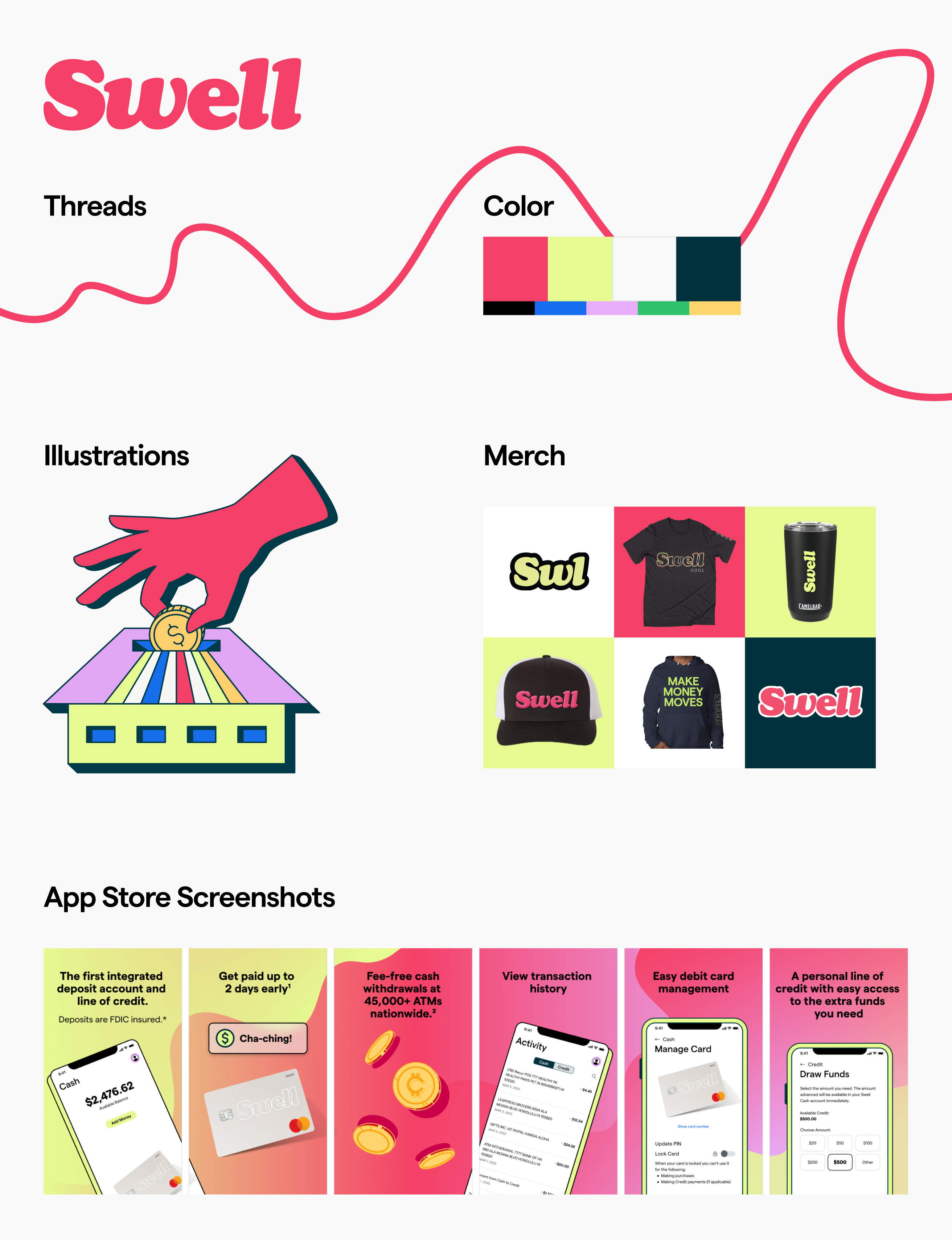
I went back to the drawing board with the existing color palette and pushed many variations under a stress test to make sure they were stand out in a crowd and could be easily used in several combinations and remain compliant with accessibility standards. The Swell lemon-lime and raspberry colors were born.

Separately, I worked closely with a contract designer to come up with a more well defined visual language that leveraged custom, dynamic vector illustrations, and threads and swoops to pull elements together.
Once these elements were built, the time came to build a design system that would work for both web and mobile environments.
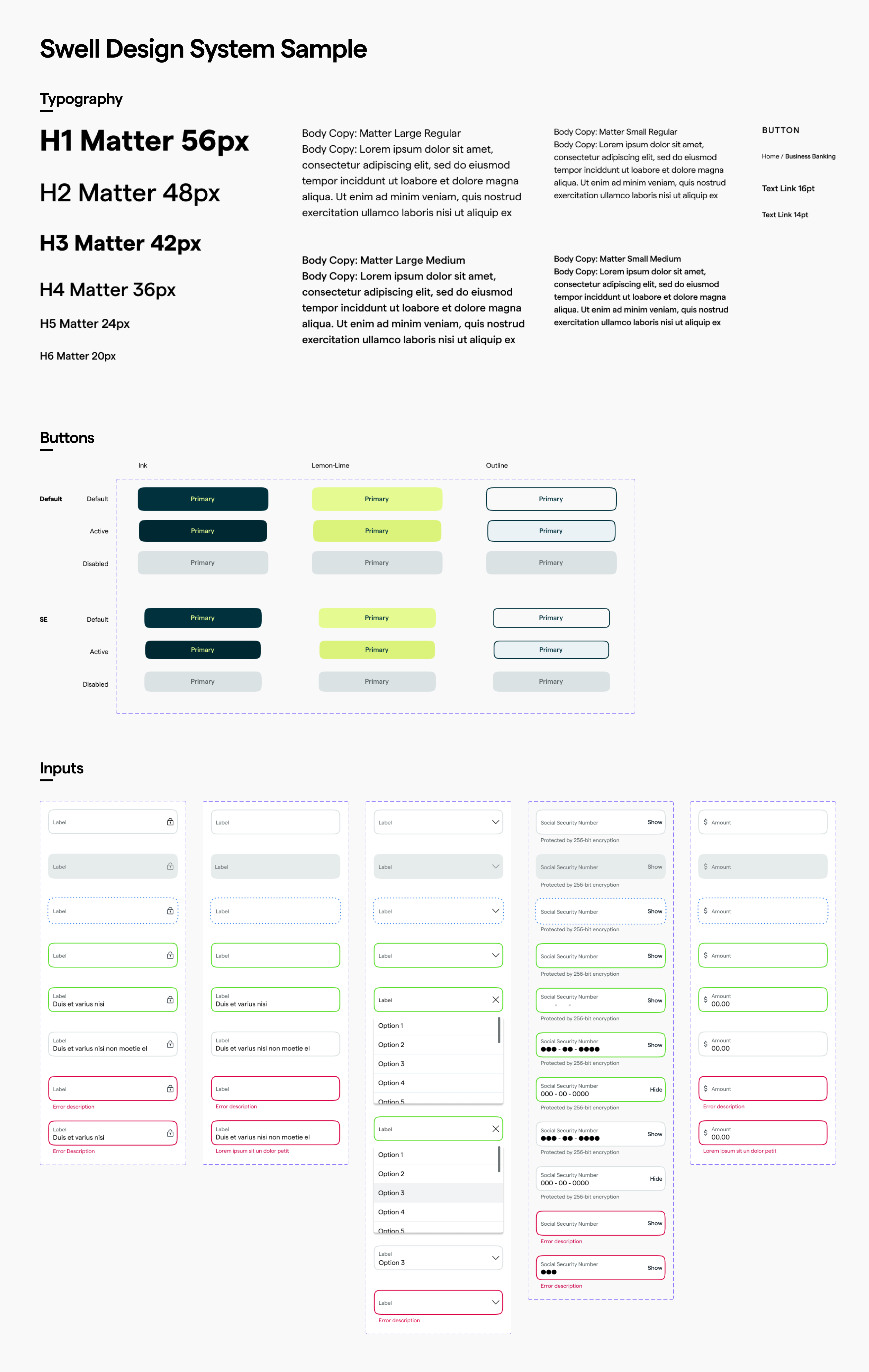
I am immensely proud of the brand built for Swell. In the highly competitive consumer fintech space, we regularly received feedback on how this brand “stands out” and seems really “cool,” and when introducing the brand to research participants, people’s faces lit up on their first impression. Even though the visual scheme was capable of being quite wild, it successfully scaled to something more professional and trust building for app screens that had a specific and more serious job to do (like when collecting social security numbers).