Lab Template Builder
B2B SAAS Product Design + ResearchCognizant // 2019
Cognizant // 2019

Lab Process Optimizer* takes instrument IOT data and centralizes it to gives labs and their scientists a real-time place to track how experiments are running. As the lead designer on Lab Process Optimizer, I drove the design strategy direction and produced most of the work seen below. A senior designer worked alongside me in most stages of the design process including user testing and interviews, workshops and assisting in producing design artifacts.
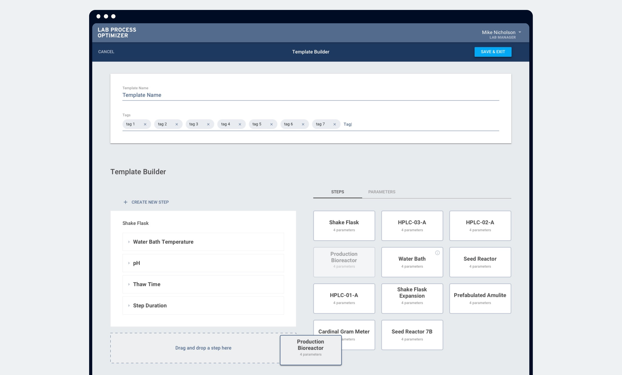
A critical piece of the Lab Process Optimizer* is a template builder where scientists or researchers are able to build out a master template for their experiments.
The goal of the product was for users to assemble detailed and highly accurate steps for their future experiments. When user testing the initial design, users found it to be clunky and difficult to learn. Some specific points of feedback included:
In addition to user testing, I leveraged Subject Matter Expert (SME) interviews to fill in gaps on how research labs operate.

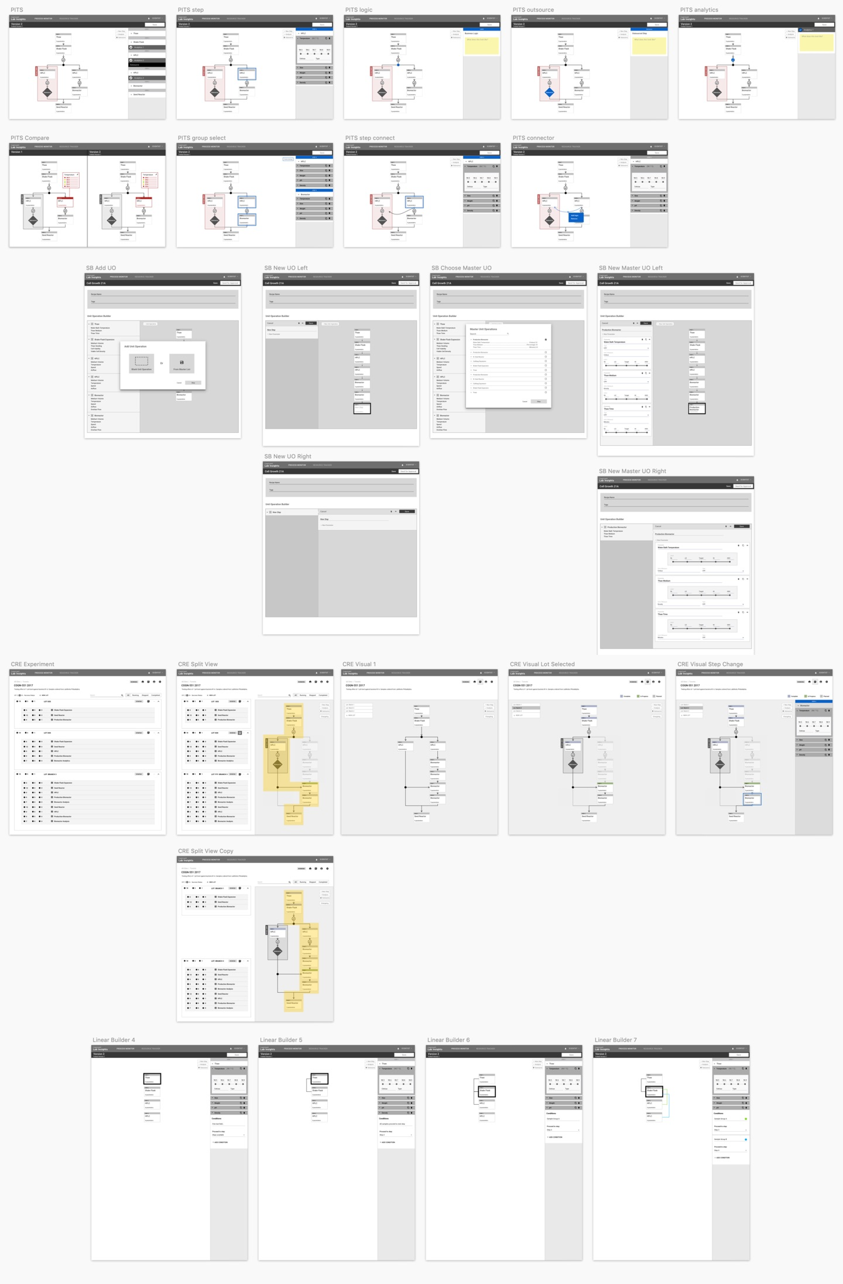
Based on the what we learned at this point, there wasn’t an easy, conclusive fix. I began the solutioning process with many iterations of sketches and wireframe prototypes. Ultimately, two new ideas were formed into more fully flushed out prototypes. The decision was made to have another user testing study, this time to compare the two designs.
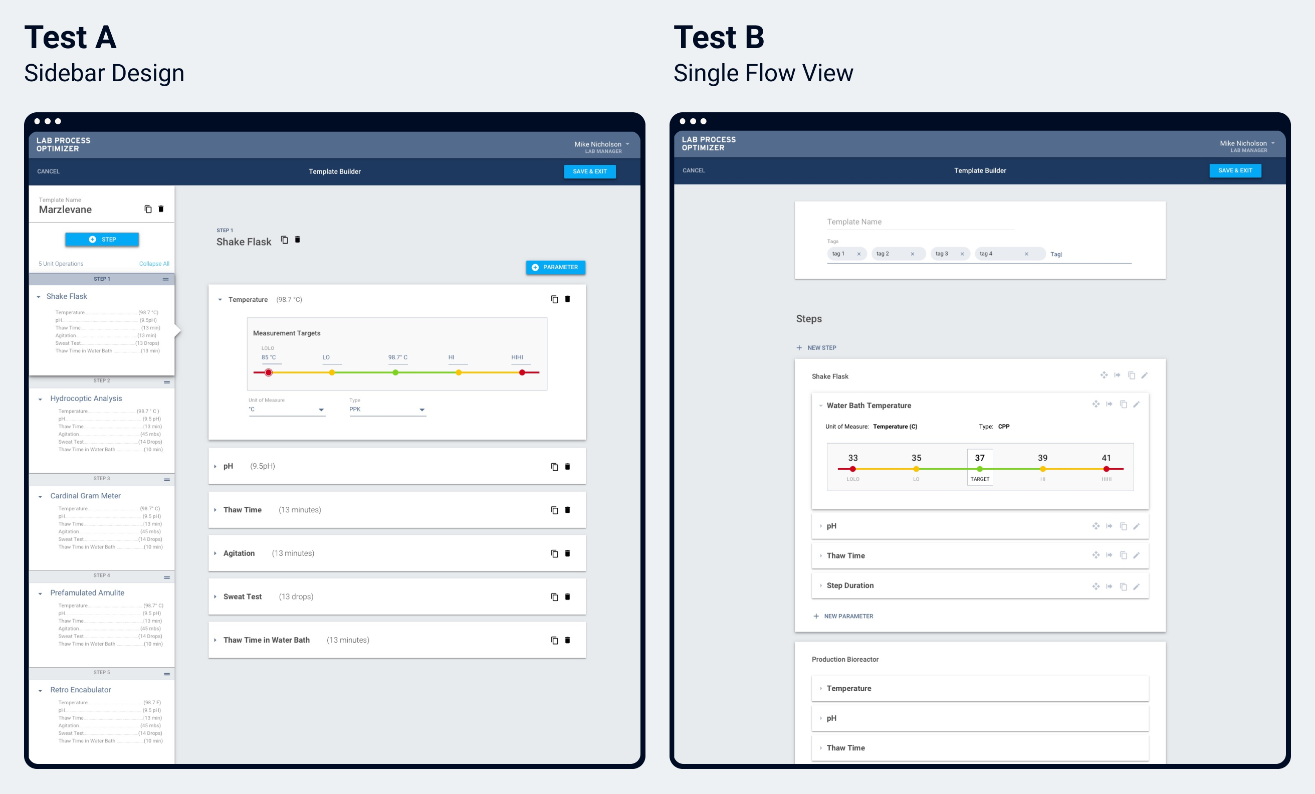
We gathered six users (three researchers, and three lab managers) and conducted moderated user interviews. Interviews were designed to have open ended discussions for the first half to learn about the participants’ labs and processes. The second half of the interviews focused on interface prototype testing.
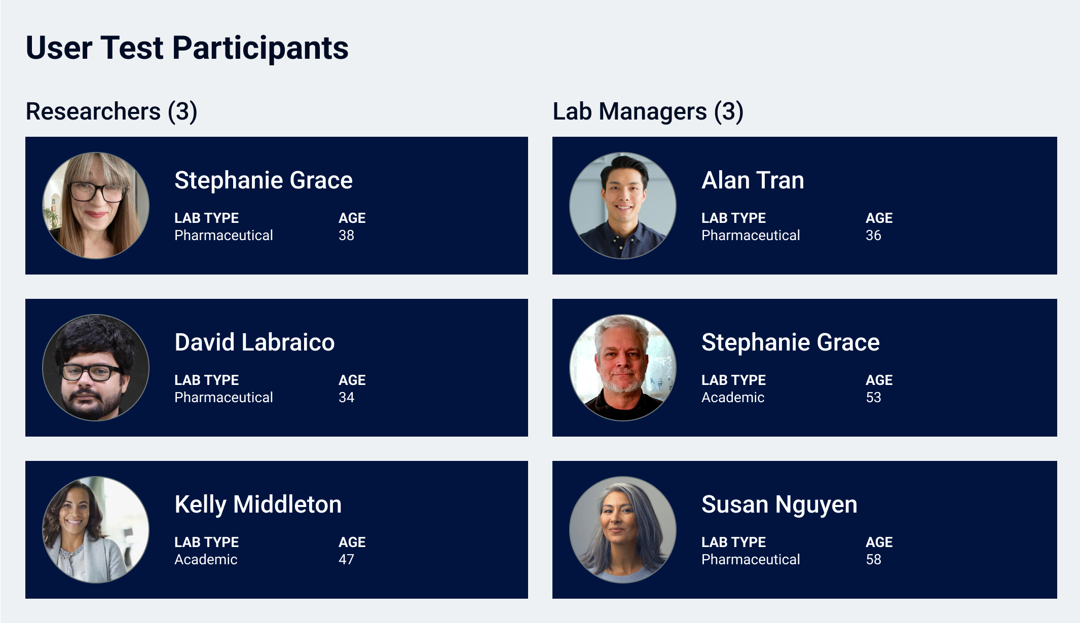
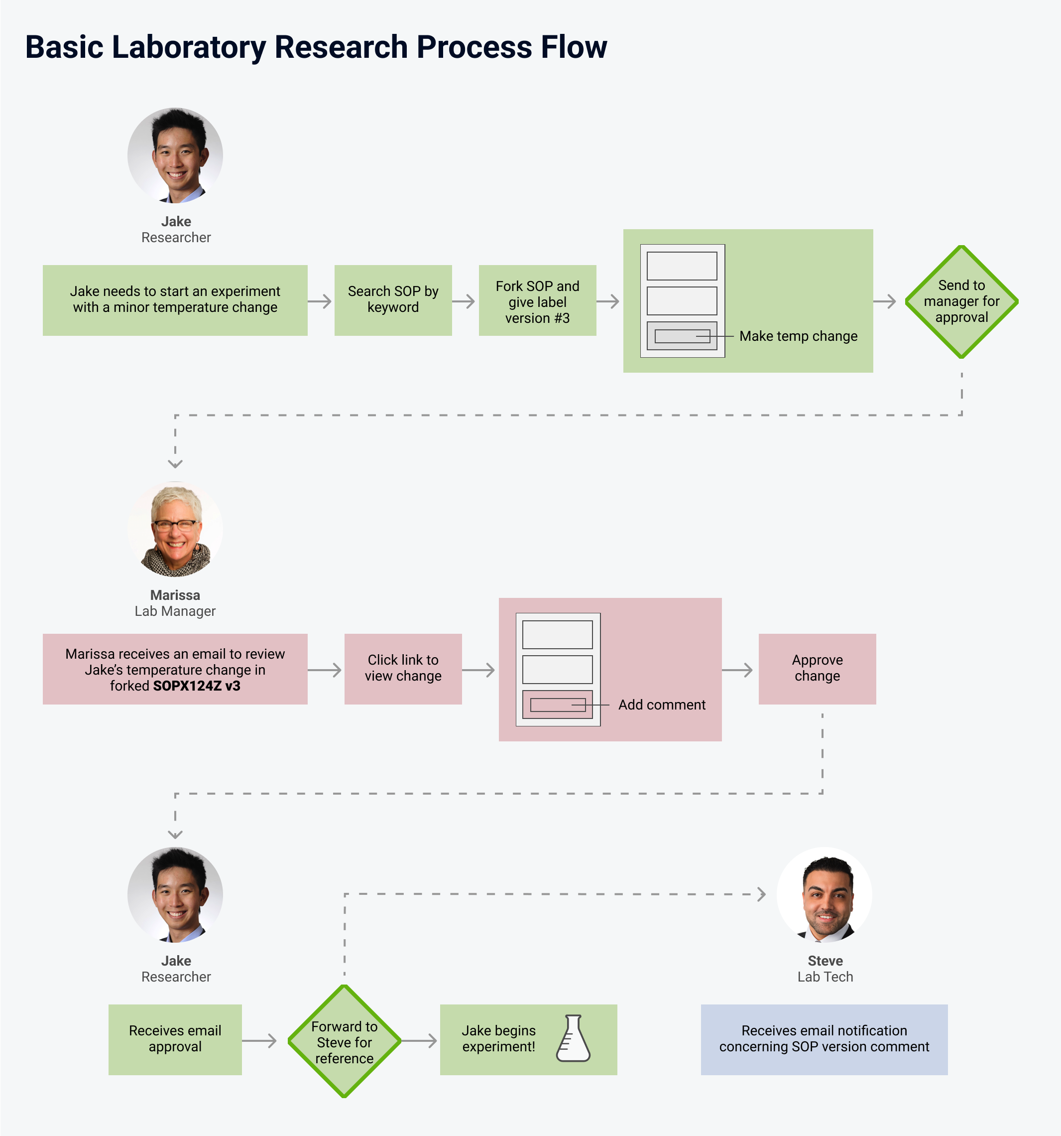
Some important learnings came from the open ended discussion with lab experts.
For the interface testing, the concept dubbed as the Sidebar Design (Test A) was a 5-to-1 winner.
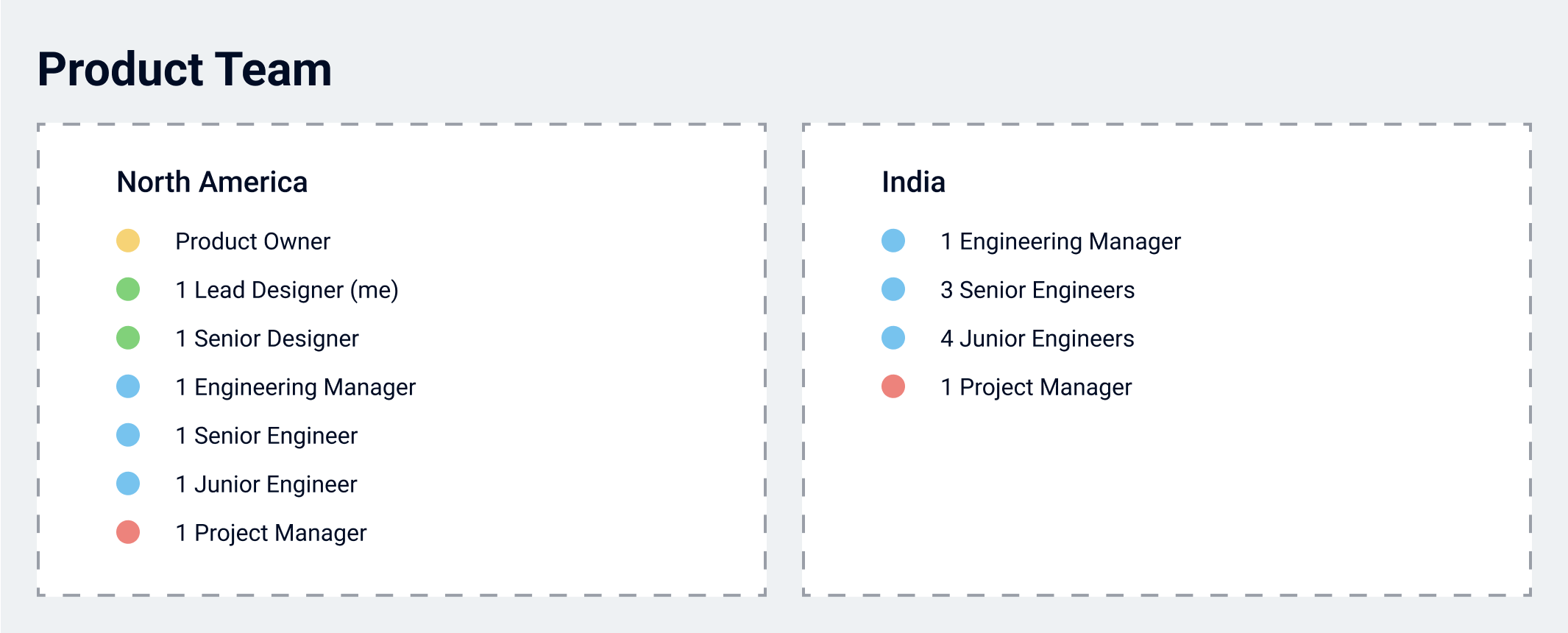
The latest learnings added some really complex scope for the application. We decided to run a series of brainstorm and ideation activities across the team to come up with ideas for solutions. For this product, the design, development and product team were distributed between Colorado, the Northeast US, and India. Because we had a 12.5 hour time difference between some teammates, I decided to break from previous models of remote workshops (typically a several-hour-long ordeal) and instead schedule a series of shorter meetings so we could boost the number people able to partake without making schedules haywire. One of the first exercises we did as a group was Crazy 8’s. This exercise was run over a Zoom call after context setting was established. The next day, everyone presented their ideas and voted on favorite concepts.
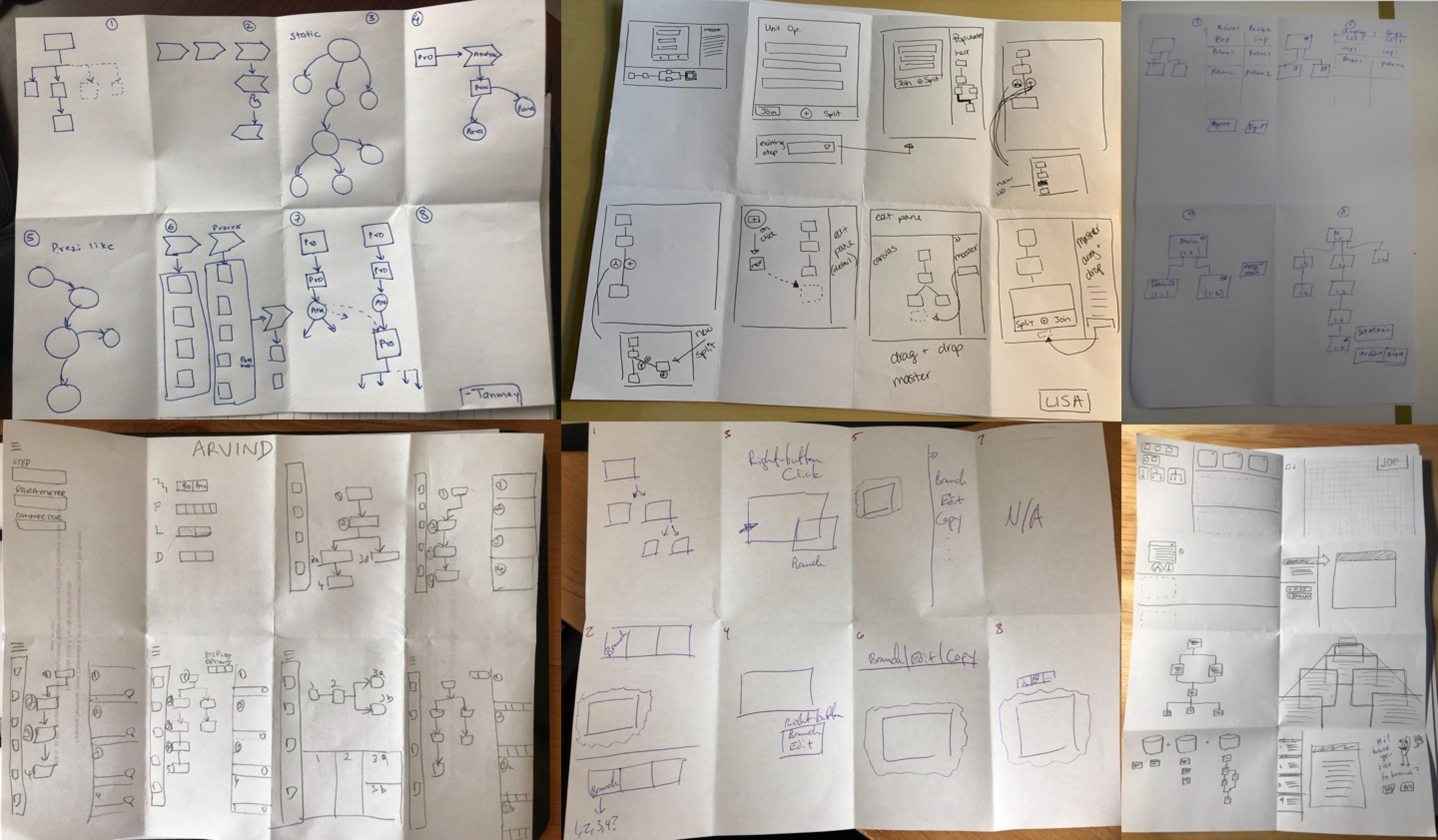
I then assigned the Solution Sketch exercise as homework. The next time we met, everyone presented their ideas. From here, I printed out everyone’s shared ideas and worked with some other design team members to analyze solutions and do dot voting.
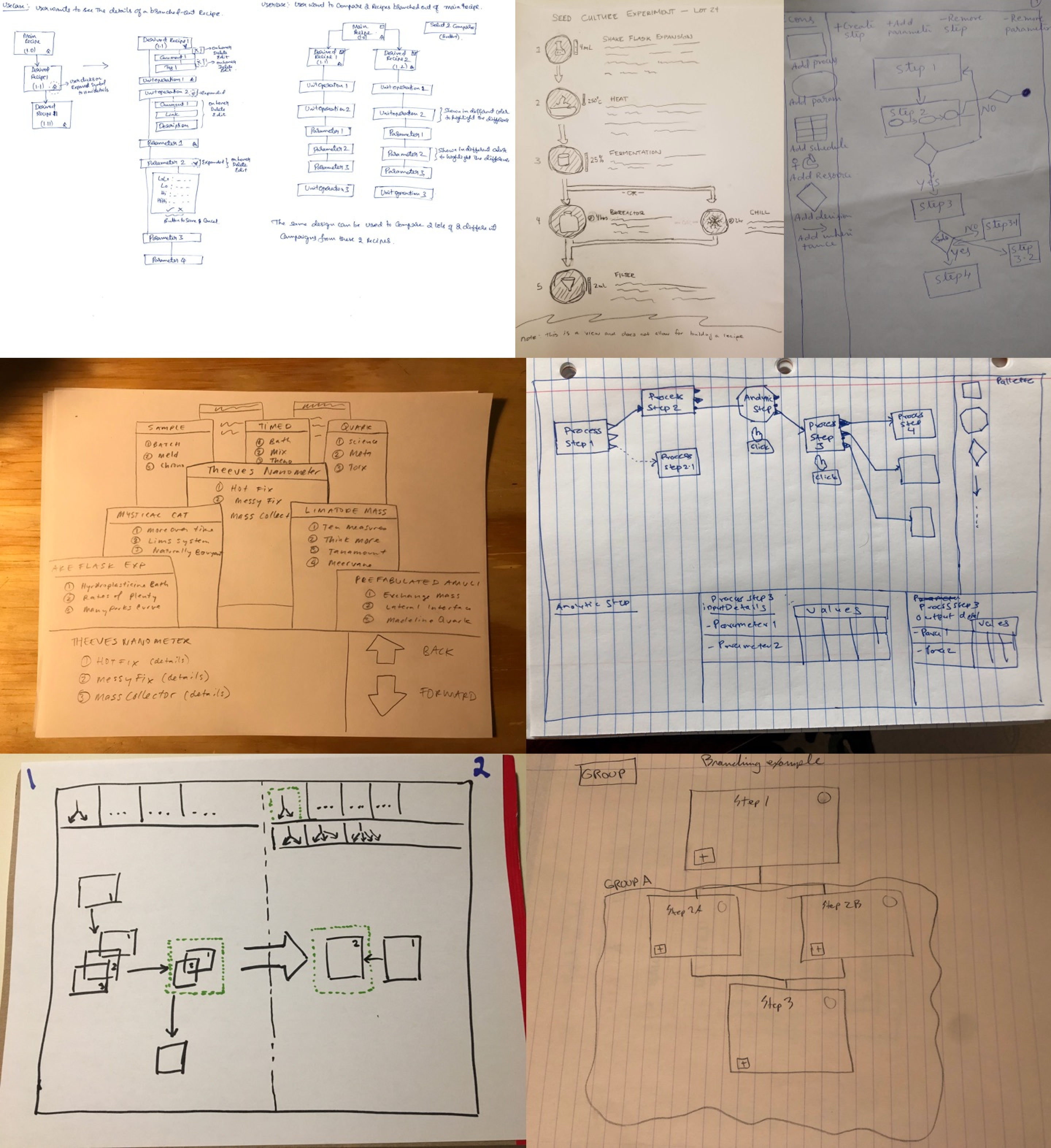
With the cumulated ideas, I assembled a series of wireframes. The purpose of the wireframes at this point was still to think big with all the concepts we had learned. By starting with a comprehensive solution, we would have a more well formed long term strategy that could be pared down into deliverable pieces.
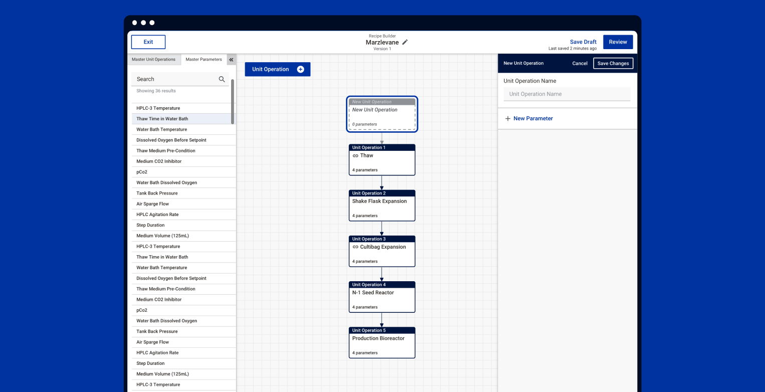
From the wireframes, we collectively decided to pursue a builder that had easy access to a library that could hold Master Unit Operations (these could typically be thought of as equipment) and Master Parameters (measurements for the equipment). These master items were placed on the left-hand side of the screen from where they could be dragged into a central space. Flows showing the relation of these items appeared in the central working space. Items could then be further customized on the right hand panel.
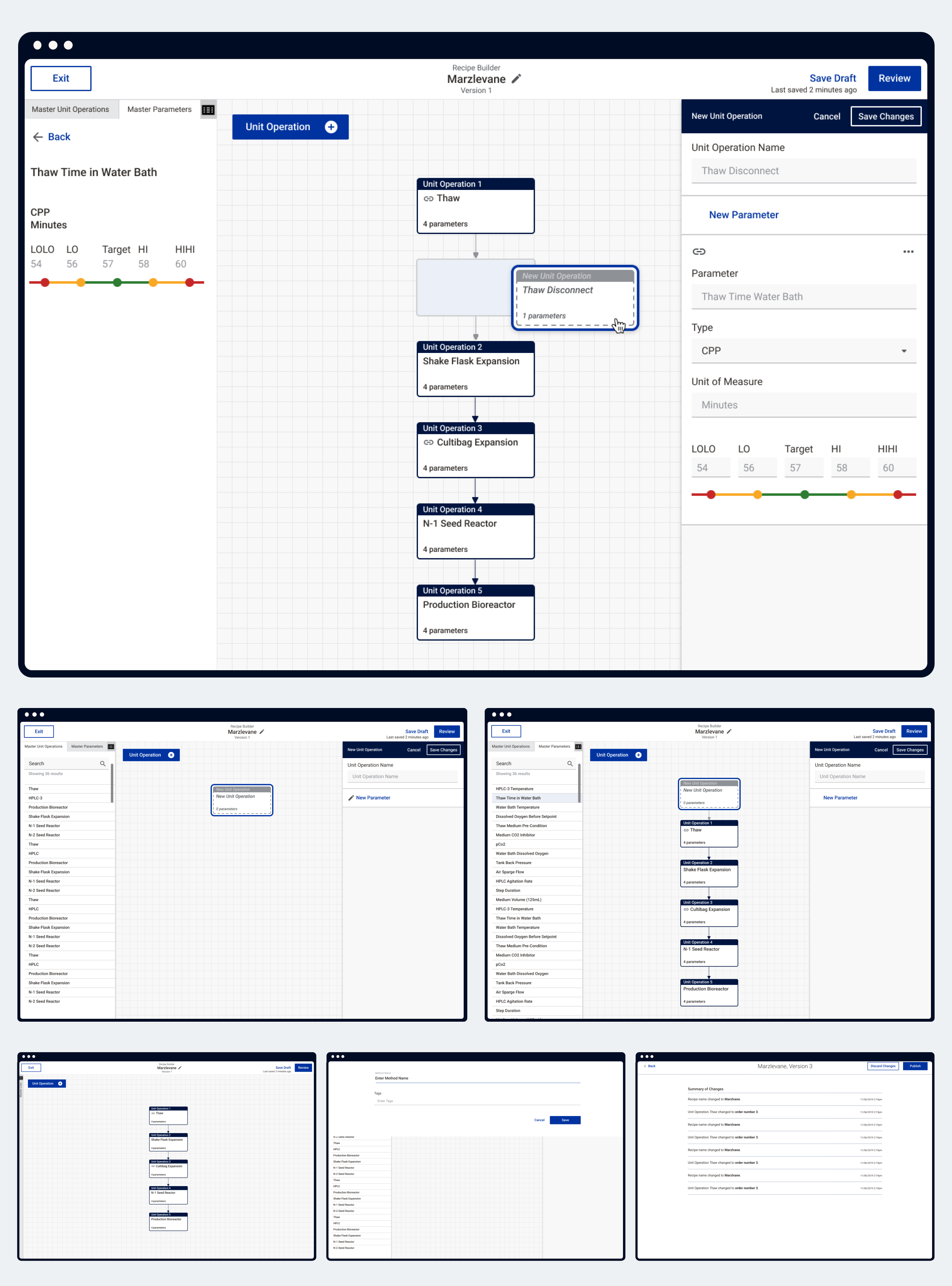
Check out the Invision prototype for the interaction experience. Try the Prototype
Taking the new builder from design concept to production environment took a big development team and a lot of coordination. Because we had an internationally distributed team, early mornings in the U.S. were reserved for sync time. A number of challenges arose during development, but with consistent feedback loops and pairing sessions, resolutions could be achieved fairly quickly.
In the two year life span of this product, the team had finally reached a point of feeling confident about the designs being put forward based on the amount of feedback that had been collected. Stakeholders and customers were impressed by the template builder and had great feedback. The final solution was assembled using well-informed research that could afford to scale in realistic ways for feature growth over time. Unfortunately around the launch of the builder, funding for the Cognizant Accelerator was pulled. The ideal next step in its journey would have been to get the builder set up in a real lab environment and tested in production.